SJOKOLADE
CLIENT: Personal project
INDUSTRY: Consumer goods
SERVICES: Packaging design
Context:
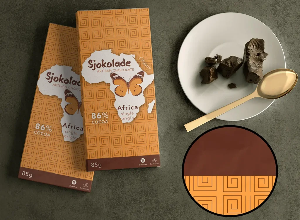
This self-initiated project was born out of a desire to explore packaging design through a specific cultural lens: the aesthetics and geometry of the African continent. I chose the name "Sjokolade" (the Afrikaans term for chocolate) to instantly anchor the product in its geographical origin.
The main objective was to create a commercial packaging concept with a strong visual impact, which would tell a clear story and precisely meet the quality expectations of a potential customer in the consumer goods industry.
Solution:
The visual approach started from studying traditional patterns, which I translated into a modern graphic language.
- Geometry and colour: The basic shape of the pattern was derived from the abstract silhouette of a butterfly. This graphic element dictated the visual direction and color palette, a selection of warm, vibrant tones specific to the African landscape.
- Composition: To highlight these colorus, I used a map of Africa as a bright and subtle background, adding depth to the composition. I integrated connecting graphic elements to ensure a unified visual style that is faithful to the source culture.
- Realism and tactility: To bring the concept from the 2D illustration stage to a tangible product, I applied an advanced texture effect. This attention to materiality perfectly simulates the tactile sensation of real chocolate packaging, adding volume and authenticity to the presentation.
Result:
The result is a vibrant, coherent, and hyper-realistic packaging design. By combining geometric illustration with textured finishes and a well-defined cultural narrative, the Sjokolade concept goes beyond a simple graphic exercise. It demonstrates the ability to deliver complete packaging solutions that not only attract attention on the shelf, but also immediately communicate the premium quality and origin of the product.